
4.6 Scored Assessment
CHARTING SALES DATA
Download Data File: SC4 Data
An effective way to communicate findings in Excel is by graphing data. Graph the attached sales information, visualizing profit margin trends, and production patterns, and the sales pipeline; enabling decision-makers to grasp concepts of current business practices.
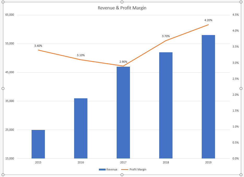
TASK 1 REVENUE & PROFIT MARGIN
Following the directions below create the below charts. Note to match each chart exactly, including the chart styles, and axis bounds.
- Open the file named SC4 Data and then Save As SC4 Sales.
- From the Revenue & Profit Margin sheet, create the below Combination Chart.
- Move the chart to a new sheet. Name the sheet Combo.
- Save your work.
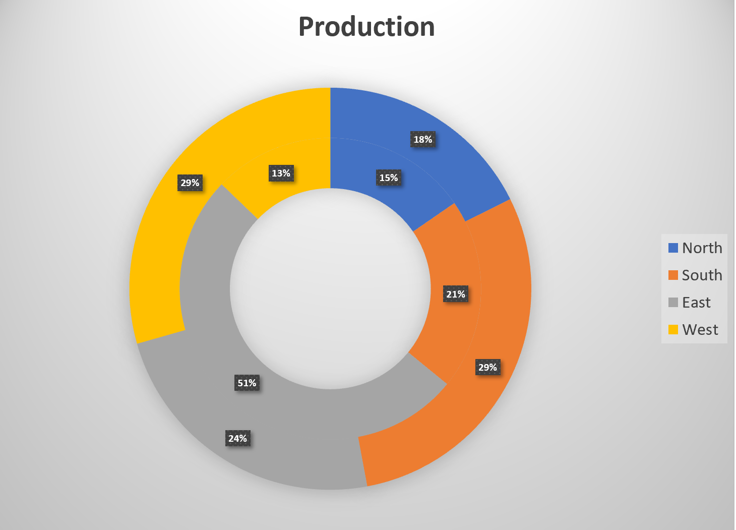
TASK 2 QUARTLY PRODUCTION DATA
Create the below Pie Chart showing how many locations will be producing products in the North, South, East and West Regions.
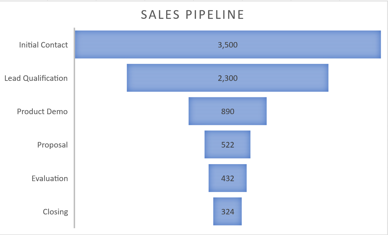
TASK 3 SALES PIPELINE
Create the below Funnel Chart to provide our sales team a visual snapshot of the company’s sales process, outlining deals that are expected to close within the month.
- From the Sales sheet, create the below Funnel Chart.
- Note to leave the chart embedded in the sheet. Resize, and move the chart accordingly.
- Check the spelling on all of the worksheets and make any necessary changes. Save your work and submit SC4 Sales as directed by your instructor.
Attribution
“4.6 Scored Assessment” by Hallie Puncochar, Portland Community College is licensed under CC BY 4.0
LICENSE

Beginning Excel 2019 by Noreen Brown; Barbara Lave; Hallie Puncochar; Julie Romey; Mary Schatz; Art Schneider; and Diane Shingledecker is licensed under a Creative Commons Attribution 4.0 International License, except where otherwise noted.