Quality Planning
It’s not enough to make sure you get a project done on time and under budget. You need to be sure you make the right product to suit your stakeholders’ needs. Quality means making sure that you build what you said you would and that you do it as efficiently as you can. And that means trying not to make too many mistakes and always keeping your project working toward the goal of creating the right product.
Everybody “knows” what quality is. But the way the word is used in everyday life is a little different from how it is used in project management. Just like the triple constraint (scope, cost, and schedule), you manage quality on a project by setting goals and taking measurements. That’s why you must understand the quality levels your stakeholders believe are acceptable, and ensure that your project meets those targets, just like it needs to meet their budget and schedule goals.
Customer satisfaction is about making sure that the people who are paying for the end product are happy with what they get. When the team gathers requirements for the specification, they try to write down all of the things that the customers want in the product so that you know how to make them happy. Some requirements can be left unstated. Those are the ones that are implied by the customer’s explicit needs. For example, some requirements are just common sense (e.g., a product that people hold can’t be made from toxic chemicals that may kill them). It might not be stated, but it’s definitely a requirement.
“Fitness to use” is about making sure that the product you build has the best design possible to fit the customer’s needs. Which would you choose: a product that’s beautifully designed, well constructed, solidly built, and all around pleasant to look at but does not do what you need, or a product that does what you want despite being ugly and hard to use? You’ll always choose the product that fits your needs, even if it’s seriously limited. That’s why it’s important that the product both does what it is supposed to do and does it well. For example, you could pound in a nail with a screwdriver, but a hammer is a better fit for the job.
Conformance to requirements is the core of both customer satisfaction and fitness to use, and is a measure of how well your product does what you intend. Above all, your product needs to do what you wrote down in your requirements document. Your requirements should take into account what will satisfy your customer and the best design possible for the job. That means conforming to both stated and implied requirements.
In the end, your product’s quality is judged by whether you built what you said you would build.
Quality planning focuses on taking all of the information available to you at the beginning of the project and figuring out how you will measure quality and prevent defects. Your company should have a quality policy that states how it measures quality across the organization. You should make sure your project follows the company policy and any government rules or regulations on how to plan quality for your project.
You need to plan which activities you will use to measure the quality of the project’s product. And you’ll need to think about the cost of all the quality-related activities you want to do. Then you’ll need to set some guidelines for what you will measure against. Finally, you’ll need to design the tests you will run when the product is ready to be tested.
Quality and Grade
According to the International Organization for Standardization (ISO), quality is “the degree to which a set of inherent characteristics fulfill requirements.” The requirements of a product or process can be categorized or given a grade that will provide a basis for comparison. The quality is determined by how well something meets the requirements of its grade.
For most people, the term quality also implies good value—getting your money’s worth. For example, even low-grade products should still work as expected, be safe to use, and last a reasonable amount of time. Consider the following examples.
Example: Quality of Gasoline Grades
Petroleum refiners provide gasoline in several different grades based on the octane rating because higher octane ratings are suitable for higher compression engines. Gasoline must not be contaminated with dirt or water, and the actual performance of the fuel must be close to its octane rating. A shipment of low-grade gasoline graded as 87 octane that is free of water or other contaminants would be of high quality, while a shipment of high-grade 93 octane gas that is contaminated with dirt would be of low quality.
Example: Quality of Furniture Packing
John has antique furniture in excellent condition that was left to him by his grandmother. The pieces are important to John for sentimental reasons, and they are valuable. John decides to hire movers (high-grade professionals) to load his furniture into the truck using appropriate padding and restraints to prevent dents and scratches during the move. John’s standard for high quality is that no observable damage occurs to his large pieces of furniture, especially the antiques. If the furniture arrives in his new apartment without a single dent, scratch, or other damage, the activity will be of high quality. John’s standard for packing his kitchen is lower. His dishes are old and cheap, so he decides to trust his inexperienced friends (low-grade amateurs) to help him pack his kitchen. If a few of the dishes or glassware are chipped or broken in the process, the savings in labour cost will more than make up for the loss and will be a good value.
Statistics
Determining how well products meet grade requirements is done by taking measurements and then interpreting those measurements. Statistics—the mathematical interpretation of numerical data—are useful when interpreting large numbers of measurements and are used to determine how well the product meets a specification when the same product is made repeatedly. Measurements made on samples of the product must be within control limits—the upper and lower extremes of allowable variation—and it is up to management to design a process that will consistently produce products between those limits.
Instructional designers often use statistics to determine the quality of their course designs. Student assessments are one way in which instructional designers are able to tell whether learning occurs within the control limits.
Example: Setting Control Limits
A petroleum refinery produces large quantities of fuel in several grades. Samples of the fuels are extracted and measured at regular intervals. If a fuel is supposed to have an 87 octane performance, samples of the fuel should produce test results that are close to that value. Many of the samples will have scores that are different from 87. The differences are due to random factors that are difficult or expensive to control. Most of the samples should be close to the 87 rating and none of them should be too far off. The manufacturer has grades of 85 and 89, so they decide that none of the samples of the 87 octane fuel should be less than 86 or higher than 88.
If a process is designed to produce a product of a certain size or other measured characteristic, it is impossible to control all the small factors that can cause the product to differ slightly from the desired measurement. Some of these factors will produce products that have measurements that are larger than desired and some will have the opposite effect. If several random factors are affecting the process, they tend to offset each other, and the most common results are near the middle of the range; this phenomenon is called the central limit theorem.
If the range of possible measurement values is divided equally into subdivisions called bins, the measurements can be sorted, and the number of measurements that fall into each bin can be counted. The result is a frequency distribution that shows how many measurements fall into each bin. If the effects that are causing the differences are random and tend to offset each other, the frequency distribution is called a normal distribution, which resembles the shape of a bell with edges that flare out. The edges of a theoretical normal distribution curve get very close to zero but do not reach zero.
Example: Normal Distribution
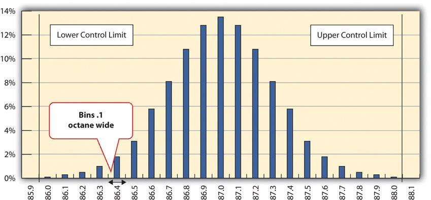
A refinery’s quality control manager measures many samples of 87 octane gasoline, sorts the measurements by their octane rating into bins that are 0.1 octane wide, and then counts the number of measurements in each bin. Then she creates a frequency distribution chart of the data, as shown in Figure 14.1.
It is common to take samples—randomly selected subsets from the total population—and measure and compare their qualities, since measuring the entire population would be cumbersome, if not impossible. If the sample measurements are distributed equally above and below the centre of the distribution as they are in Figure 14.1, the average of those measurements is also the centre value that is called the mean, and is represented in formulas by the lowercase Greek letter µ (pronounced mu). The amount of difference of the measurements from the central value is called the sample standard deviation or just the standard deviation.
The first step in calculating the standard deviation is subtracting each measurement from the central value (mean) and then squaring that difference. (Recall from your mathematics courses that squaring a number is multiplying it by itself and that the result is always positive.) The next step is to sum these squared values and divide by the number of values minus one. The last step is to take the square root. The result can be thought of as an average difference. (If you had used the usual method of taking an average, the positive and negative numbers would have summed to zero.) Mathematicians represent the standard deviation with the lowercase Greek letter σ (pronounced sigma). If all the elements of a group are measured, instead of just a sample, it is called the standard deviation of the population and in the second step, the sum of the squared values is divided by the total number of values.
Figure 14.1 shows that the most common measurements of octane rating are close to 87 and that the other measurements are distributed equally above and below 87. The shape of the distribution chart supports the central limit theorem’s assumption that the factors that are affecting the octane rating are random and tend to offset each other, which is indicated by the symmetric shape. This distribution is a classic example of a normal distribution. The quality control manager notices that none of the measurements are above 88 or below 86 so they are within control limits, and she concludes that the process is working satisfactorily.
Example: Standard Deviation of Gasoline Samples
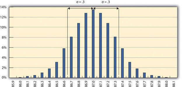
The refinery’s quality control manager uses the standard deviation function in her spreadsheet program to find the standard deviation of the sample measurements and finds that for her data, the standard deviation is 0.3 octane. She marks the range on the frequency distribution chart to show the values that fall within one sigma (standard deviation) on either side of the mean (Figure 14.2).
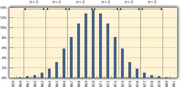
For normal distributions, about 68.3% of the measurements fall within one standard deviation on either side of the mean. This is a useful rule of thumb for analyzing some types of data. If the variation between measurements is caused by random factors that result in a normal distribution, and someone tells you the mean and the standard deviation, you know that a little over two-thirds of the measurements are within a standard deviation on either side of the mean. Because of the shape of the curve, the number of measurements within two standard deviations is 95.4%, and the number of measurements within three standard deviations is 99.7%. For example, if someone said the average (mean) height for adult men in the United States is 178 cm (70 inches) and the standard deviation is about 8 cm (3 inches), you would know that 68% of the men in the United States are between 170 cm (67 inches) and 186 cm (73 inches) in height. You would also know that about 95% of the adult men in the United States were between 162 cm (64 inches) and 194 cm (76 inches) tall, and that almost all of them (99.7%) are between 154 cm (61 inches) and 202 cm (79 inches) tall. These figures are referred to as the 68-95-99.7 rule.
Example: Gasoline within Three Standard Deviations
The refinery’s quality control manager marks the ranges included within two and three standard deviations, as shown in Figure 14.3. Some products must have less variability than others to meet their purpose. For example, if training designed to operate highly specialized and potentially dangerous machinery was assessed for quality, most participants would be expected to exceed the acceptable pass rate. Three standard deviations from the control limits might be fine for some products but not for others. In general, if the mean is six standard deviations from both control limits, the likelihood of a part exceeding the control limits from random variation is practically zero (2 in 1,000,000,000).
Example: A Step Project Improves Quality of Gasoline
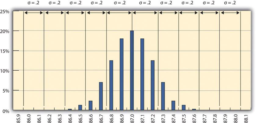
A new refinery process is installed that produces fuels with less variability. The refinery’s quality control manager takes a new set of samples and charts a new frequency distribution diagram, as shown in Figure 14.4. The refinery’s quality control manager calculates that the new standard deviation is 0.2 octane. From this, she can use the 68-95-99.7 rule to estimate that 68.3% of the fuel produced will be between 86.8 and 87.2 and that 99.7% will be between 86.4 and 87.6 octane. A shorthand way of describing this amount of control is to say that it is a five-sigma production system, which refers to the five standard deviations between the mean and the control limit on each side.
Quality planning tools
High quality is achieved by planning for it rather than by reacting to problems after they are identified. Standards are chosen and processes are put in place to achieve those standards.
Measurement Terminology
During the execution phase of the project, services and products are sampled and measured to determine if the quality is within control limits for the requirements and to analyze causes for variations. This evaluation is often done by a separate quality control group, and knowledge of a few process measurement terms is necessary to understand their reports. Several of these terms are similar, and it is valuable to know the distinction between them.
The quality plan specifies the control limits of the product or process; the size of the range between those limits is the tolerance. Tolerances are often written as the mean value, plus or minus the tolerance. The plus and minus signs are written together, ±.
Example: Tolerance in Gasoline Production
The petroleum refinery chose to set its control limits for 87 octane gasoline at 86 and 88 octane. The tolerance is 87 ± 1.
Tools are selected that can measure the samples closely enough to determine if the measurements are within control limits and if they are showing a trend. Each measurement tool has its own tolerances.
The choice of tolerance directly affects the cost of quality (COQ). In general, it costs more to produce and measure products that have small tolerances. The costs associated with making products with small tolerances for variation can be very high and not proportional to the gains. For example, if the cost of evaluating each screen as it is created in an online tutorial is greater than delivering the product and fixing any issues after the fact, then the COQ may be too high and the instructional designer will tolerate more defects in the design.
Defining and Meeting Client Expectations
Clients provide specifications for the project that must be met for the project to be successful. Recall that meeting project specifications is one definition of project success. Clients often have expectations that are more difficult to capture in a written specification. For example, one client will want to be invited to every meeting of the project and will then select the ones that seem most relevant. Another client will want to be invited only to project meetings that need client input. Inviting this client to every meeting will cause unnecessary frustration. Listening to the client and developing an understanding of the expectations that are not easily captured in specifications is important to meeting those expectations.
Project surveys can capture how the client perceives the project performance and provide the project team with data that are useful in meeting client expectations. If the results of the surveys indicate that the client is not pleased with some aspect of the project, the project team has the opportunity to explore the reasons for this perception with the client and develop recovery plans. The survey can also help define what is going well and what needs improvement.
Sources of Planning Information
Planning for quality is part of the initial planning process. The early scope, budget, and schedule estimates are used to identify processes, services, or products where the expected grade and quality should be specified. Risk analysis is used to determine which of the risks to the project could affect quality.
Techniques
Several different tools and techniques are available for planning and controlling the quality of a project. The extent to which these tools are used is determined by the project complexity and the quality management program in use by the client.
The following represents the quality planning tools available to the project manager.
- Cost-benefit analysis is looking at how much your quality activities will cost versus how much you will gain from doing them. The costs are easy to measure; the effort and resources it takes to do them are just like any other task on your schedule. Since quality activities don’t actually produce a product, it is sometimes harder for people to measure the benefit. The main benefits are less reworking, higher productivity and efficiency, and more satisfaction from both the team and the customer.
- Benchmarking means using the results of quality planning on other projects to set goals for your own. You might find that the last project in your company had 20% fewer defects than the one before it. You should want to learn from a project like that and put in practice any of the ideas they used to make such a great improvement. Benchmarks can give you some reference points for judging your own project before you even start the work.
- Design of experiments is the list of all the kinds of tests you are going to run on your product. It might list all the kinds of test procedures you’ll do, the approaches you’ll take, and even the tests themselves. (In the software world, this is called test planning.)
- Cost of quality is what you get when you add up the cost of all the prevention and inspection activities you are going to do on your project. It doesn’t just include the testing. It includes any time spent writing standards, reviewing documents, meeting to analyze the root causes of defects, reworking to fix the defects once they’re found by the team: in other words, absolutely everything you do to ensure quality on the project. Cost of quality can be a good number to check to determine whether your project is doing well or having trouble. Say your company tracks the cost of quality on all of its projects; then you could tell if you are spending more or less than has been spent on other projects to get your project up to quality standards.
- Control charts can be used to define acceptable limits. If some of the functions of a project are repetitive, statistical process controls can be used to identify trends and keep the processes within control limits. Part of the planning for controlling the quality of repetitive processes is to determine what the control limits are and how the process will be sampled.
- Cause-and-effect diagrams can help in discovering problems. When control charts indicate an assignable cause for a variation, it is not always easy to identify the cause of a problem. Discussions that are intended to discover the cause can be facilitated using a cause-and-effect or fishbone diagram where participants are encouraged to identify possible causes of a defect.
Example: Diagramming Quality Problems
A small manufacturing firm tries to identify the assignable causes to variations in its manufacturing line. They assemble a team that identifies six possibilities:
- Low-quality raw materials
- Power fluctuation
- Ambient temperature
- Worker absenteeism
- Poor training
- Old equipment
Each of these possibilities are organized into a fishbone diagram in Figure 14.5:
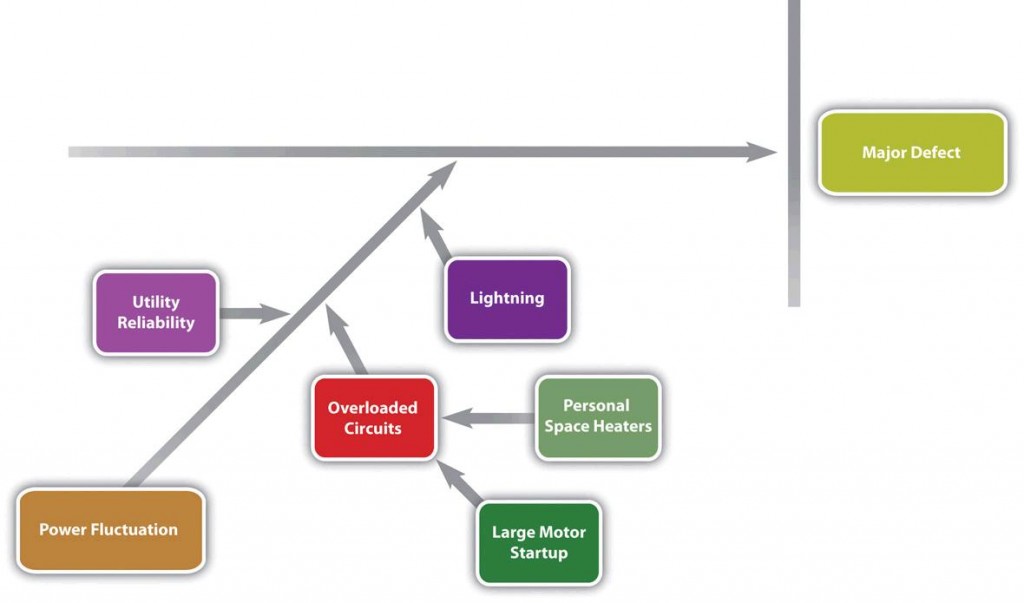
Each branch of the diagram can be expanded to break down a category into more specific items. An engineer and an electrician work on one of the branches to consider possible causes of power fluctuation. They identify:
- Utility reliability
- Personal space heaters and large motor start up leading to over loaded circuits
- Lighting
Those items are added to their part of the fishbone diagram, as shown in Figure 14.6.
Check sheets, histograms, and Pareto charts are used to solve several quality problems. When a quality-control issue occurs, a project manager must choose which problem to address first. One way to prioritize quality problems is to determine which ones occur most frequently. These data can be collected using a check sheet, which is a basic form on which the user can make a check in the appropriate box each time a problem occurs or by automating the data collection process using the appropriate technology. Once the data are collected, they can be analyzed by creating a type of frequency distribution chart called a histogram. A true histogram is a column chart where the widths of the columns fill the available space on the x-axis axis and are proportional to the category values displayed on that axis, while the height of the columns is proportional to the frequency of occurrences. Most histograms use one width of column to represent a category, while the vertical axis represents the frequency of occurrences.
A variation on the histogram is a frequency distribution chart invented by economist Vilfredo Pareto known as a Pareto chart, in which the columns are arranged in decreasing order with the most common on the left and a line added that shows the cumulative total. The combination of columns and a line allows the user to tell at a glance which problems are most frequent and what fraction of the total they represent.
Once you have your quality plan, you know your guidelines for managing quality on the project. Your strategies for monitoring project quality should be included in the plan, as well as the reasons for all the steps you are taking. It’s important that everyone on the team understand the rationale behind the metrics being used to judge success or failure of the project.
Quality Assurance
The purpose of quality assurance is to create confidence that the quality plan and controls are working properly. Time must be allocated to review the original quality plan and compare that plan to how quality is being ensured during the implementation of the project.
Process Analysis
The flowcharts of quality processes are compared to the processes followed during actual operations. If the plan was not followed, the process is analyzed and corrective action taken. The corrective action could be to educate the people involved on how to follow the quality plan, or it could be to revise the plan.
The experiments that sample products and processes and collect data are examined to see if they are following statistically valid sampling techniques and that the measurement methods have small enough tolerances to detect variation within control limits.
Because projects are temporary, there are fewer opportunities to learn and improve within a project, especially if it has a short duration. But even in short projects, the quality manager should have a way to learn from experience and change the process for the next project of a similar complexity profile.
Example: Analyzing Quality Processes in Safety Training
A technical college responsible for training employees in safe plant practices evaluates its instructor selection process at the end of the training to see if it had the best criteria for selection. For example, it required the instructors to have master’s degrees in manufacturing to qualify as college instructors. The college used an exit survey of the students to ask what they thought would improve the instruction of future classes on this topic. Some students felt that it would be more important to require that the instructors have more years of training experience, while others recommended that instructors seek certification at a training centre. The college considered these suggestions and decided to retain its requirement of a master’s degree but add a requirement that instructors be certified in plant safety.
The purpose of quality assurance is to build confidence in the client that quality standards and procedures are being followed. This is done by an internal review of the plan, testing, and revisions policies or by an audit of the same items performed by an external group or agency.
Text Attributions
This chapter of Project Management is a derivative of the following text:
- Project Management for Instructional Designers by Wiley, et al. © CC BY-NC-SA (Attribution-NonCommercial-ShareAlike)
Media Attributions
- Normal Distribution of Measurements © Wiley et al is licensed under a CC BY-NC-SA (Attribution NonCommercial ShareAlike) license
- One Sigma Range © Wylie, et al. is licensed under a CC BY-NC-SA (Attribution NonCommercial ShareAlike) license
- 68-95-99 Rule © Wiley et al is licensed under a CC BY-NC-SA (Attribution NonCommercial ShareAlike) license
- Smaller Standard Deviation © Wiley et al is licensed under a CC BY-NC-SA (Attribution NonCommercial ShareAlike) license
- Cause and Effect Diagram © Wiley et al is licensed under a CC BY-NC-SA (Attribution NonCommercial ShareAlike) license
- Power Fluctuation Diagram © Wiley et al is licensed under a CC BY-NC-SA (Attribution NonCommercial ShareAlike) license


No Comments