Why Use Landing Pages?
Ad campaigns can aim at building awareness, but they are typically associated with making consumers achieve specific goals, such as trying out software for free, registering for an account, sending an email to a company, or downloading a free piece of content.
When running ads that have such goals, sending visitors to a website is counterproductive: a website is not meant to convert, i.e., to make consumers achieve a specific goal. If consumers are directed to a website, they will be faced with hundreds of potential actions (associated with the links available on a website), one of which is the action they should be performing. It becomes easy for consumers to get lost.
Inc comparison, landing pages are focused on help consumers achieve only one goal. They facilitate conversion. They do so by allowing to tailor the page to the exact goal that users should accomplish. This can be achieved, for example, by offering a clearer message to consumers (vs. bringing consumers to a website), by minimizing the potential actions they can perform on the page, and by matching the visuals of an ad with that the landing page. We will delve in depth into some of these benefits of landing pages when discussing conversion optimization in chapter 10.
Take, for example, the ad for Shopify shown in Figure 5.5.
Figure 5.5 Shopify Ad

The goal for consumers associated with this ad is to try Shopify for free and create an online store today. How can we maximize the chances that consumers will do so?
When creating this ad, the question that a digital marketer faces is: where do I bring visitors? Ideally, you want to bring visitors to a place that will ensure that they will achieve the goal of trying Shopify.
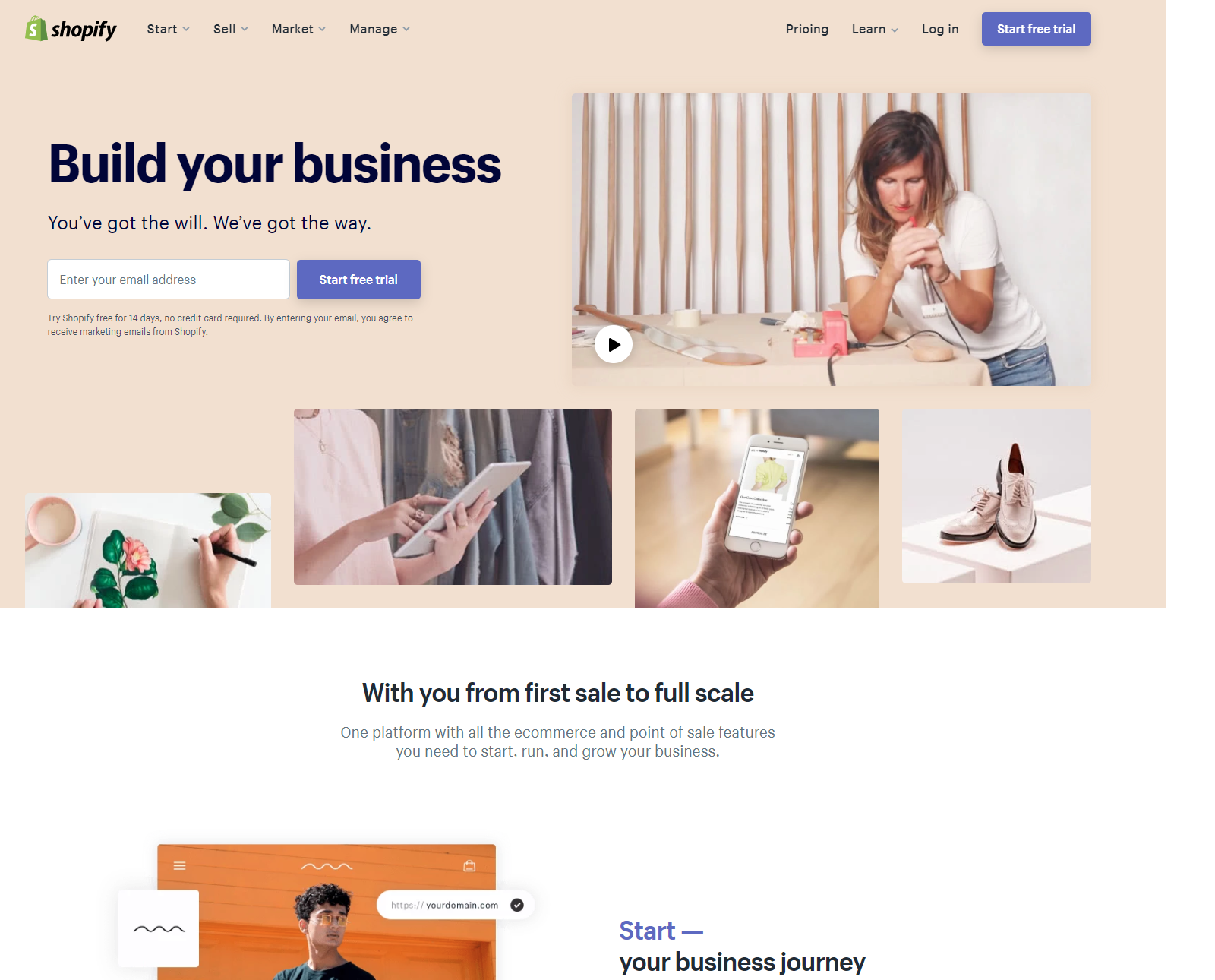
A first option could be the homepage of Shopify shown in Figure 5.6.
Figure 5.6 Shopify Homepage

Although this page has a box at the very top that incites people to try out Shopify for free, visitors are also offered a wide array of competing actions. They can click any of the links at the top of the page (“Start,” “Sell,” “Market,” “Manage,” “Pricing,” and “Learn”); they can scroll down to learn more about Shopify, and at the very bottom, they can also access information such as “About” Shopify and “Terms and Conditions.” In short, they can do a lot more than simply trying Shopify for free.
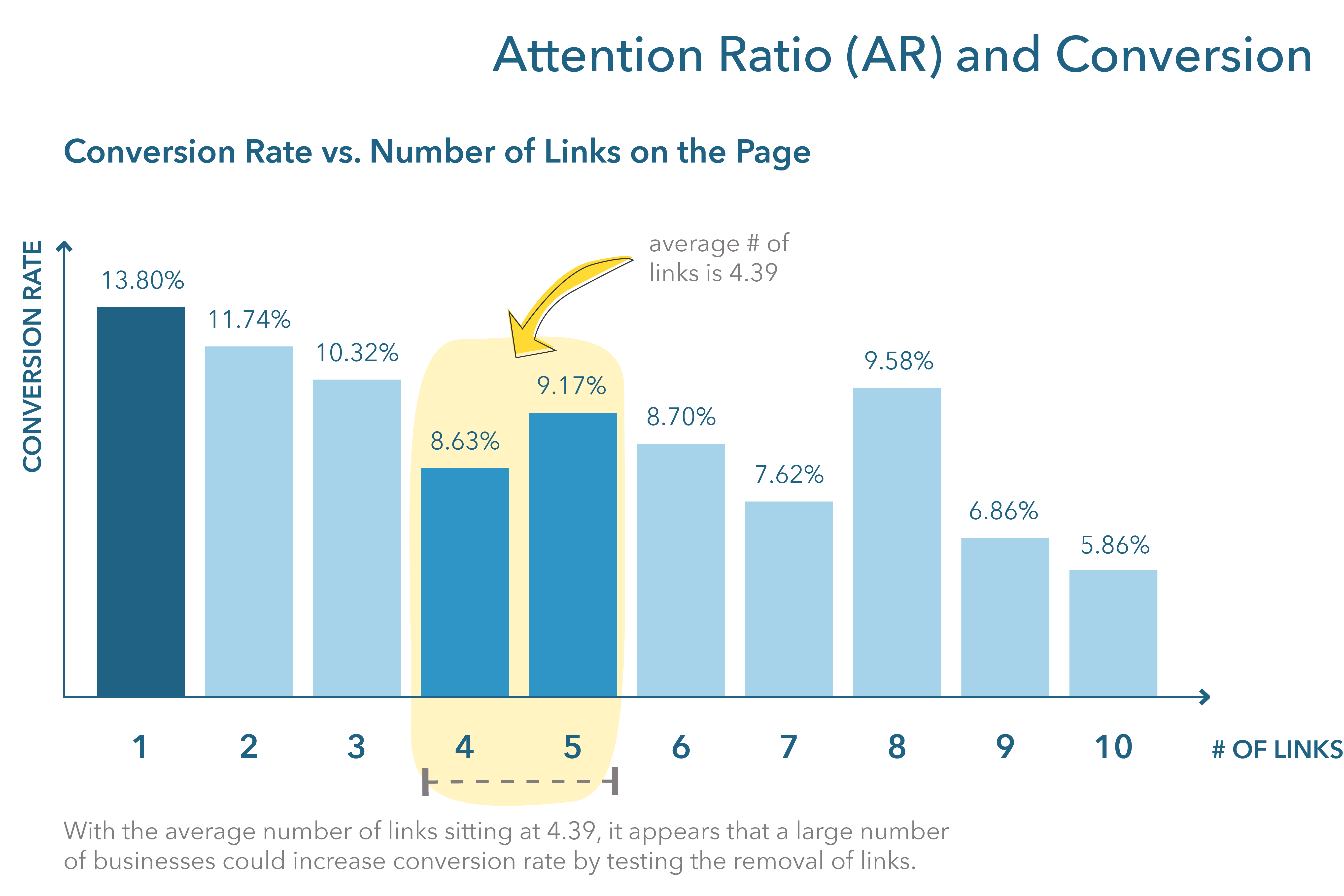
Over time, digital marketers have learned that one of the easiest ways to ensure that visitors will do what you want them to do is to limit the possibilities to just the one action you want visitors to take—in this case, signing up to try Shopify for free. The chart in Figure 5.7 exemplifies this by showing the conversion rate vs. the number of links on a page.
Figure 5.7 AR Conversion

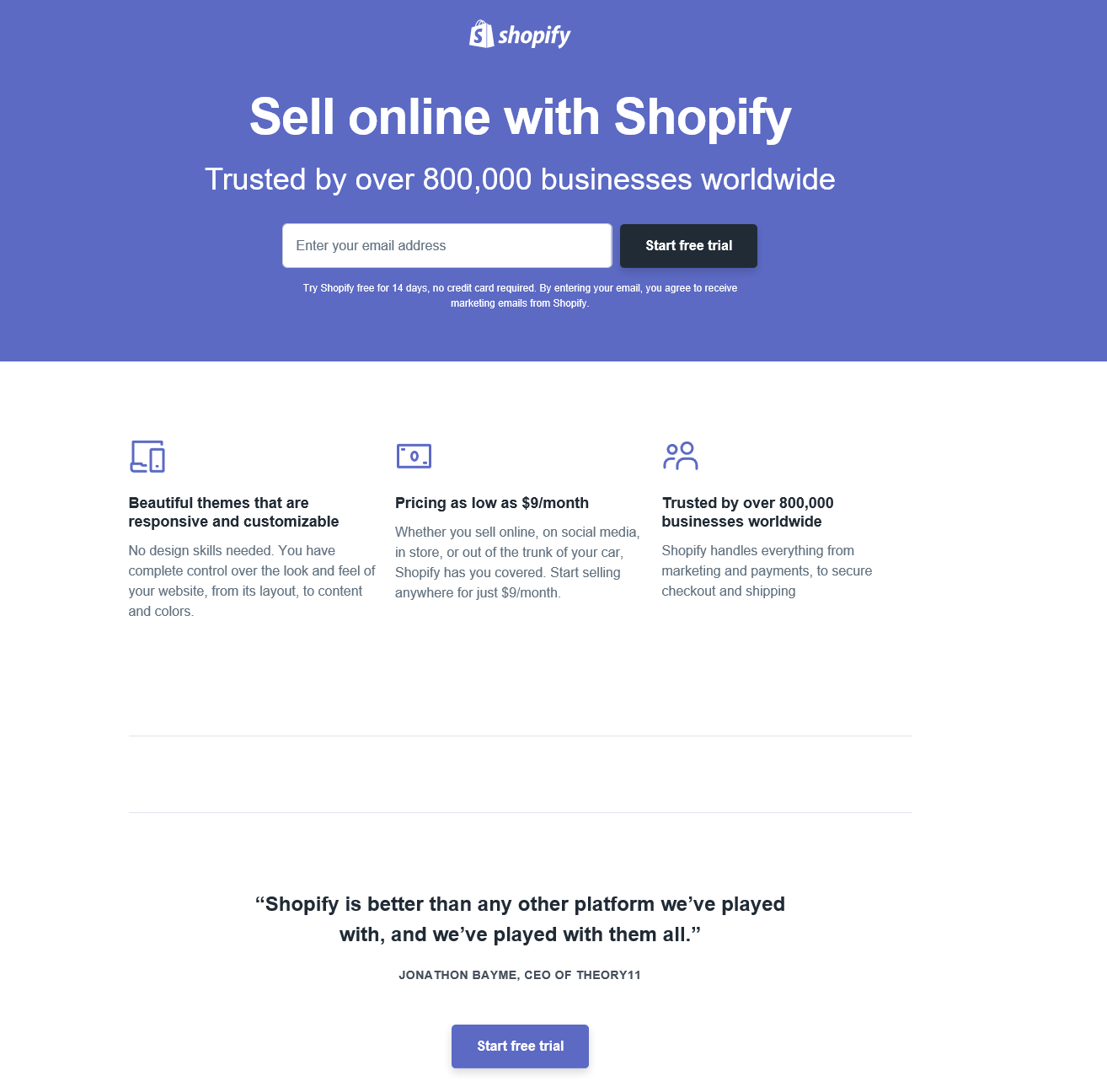
For this reason, the Shopify ad doesn’t redirect consumers to the Shopify homepage. Rather, they created a dedicated landing page where the only possible thing for visitors to do after clicking the ad is to start their free trial. Figure 5.8 shows the landing page.
Figure 5.8 Shopify Landing Page

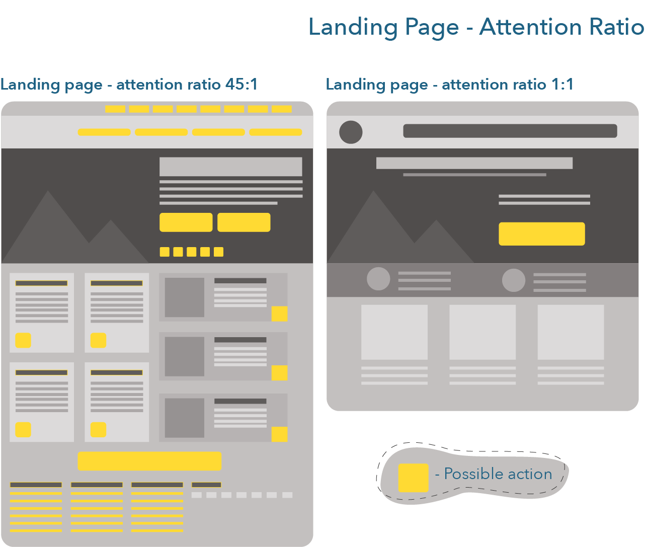
By focusing visitors’ attention to the task at hand (i.e., trying Shopify for free), we can maximize the conversion rate, i.e., the number of visitors who will achieve the goal we want them to achieve. A metric created to better understand the relationship between the number of possible actions on a website and the number of goals for consumers is the attention ratio. Figure 5.9 demonstrates how a website has a high attention ratio (i.e., many possible actions vs. what you want consumers to be doing) and why a landing page is ideal for pushing visitors to perform the action we want them to perform. Landing pages should have an attention ratio of 1:1, meaning one possible action to one goal.
Figure 5.9 Landing Page – Attention Ratio

