
Introduction to Demand
Introduction to Demand
What you’ll learn to do: explain the law of demand
Imagine that the price of Ben & Jerry’s ice cream decreases by 25 percent during the next summer. What do you think will happen to the amount of Ben & Jerry’s ice cream that people will want to buy? Clearly, the demand for ice cream will increase. By the same token, if the price of the ice cream were to rise by 25 percent, then the demand for the ice cream would fall. In this section, you will examine the law of demand and see why this simple concept is essential to understanding economics.
1. The Law of Demand
LEARNING OUTCOMES
- Explain the law of demand
- Explain a demand curve
Demand describes the amount of goods or services that consumers want to (and are able to) pay in order to purchase that good or service. Before learning more about the details of demand, watch this video to get a basic understanding about what it is and its importance to understanding economic behavior.
You can view the transcript for “Episode 11 – Demand” (opens in new window).
The law of demand states that, other things being equal:
- More of a good will be bought, the lower its price
- Less of a good will be bought, the higher its price
Ceteris paribus means “other things being equal.”
Demand for Goods and Services

Economists use the term demand to refer to the amount of some good or service consumers are willing and able to purchase at each price. Demand is based on needs and wants—a consumer may be able to differentiate between a need and a want, but from an economist’s perspective, they are the same thing. Demand is also based on ability to pay. If you can’t pay for it, then you have no effective demand.
What a buyer pays for a unit of the specific good or service is called the price. The total number of units purchased at that price is called the quantity demanded. A rise in the price of a good or service almost always decreases the quantity of that good or service demanded. Conversely, a fall in price will increase the quantity demanded. When the price of a gallon of gasoline goes up, for example, people look for ways to reduce their consumption by combining several errands, commuting by carpool or mass transit, or taking weekend or vacation trips closer to home. Economists call this inverse relationship between price and quantity demanded the law of demand. The law of demand assumes that all other variables that affect demand are held constant.
An example from the market for gasoline can be shown in the form of a table or a graph. A table that shows the quantity demanded at each price, such as Table 1, is called a demand schedule. Price in this case is measured in dollars per gallon of gasoline. The quantity demanded is measured in millions of gallons over some time period (for example, per day or per year) and over some geographic area (like a state or a country).
| Price (per gallon) | Quantity Demanded (millions of gallons) |
|---|---|
| $1.00 | 800 |
| $1.20 | 700 |
| $1.40 | 600 |
| $1.60 | 550 |
| $1.80 | 500 |
| $2.00 | 460 |
| $2.20 | 420 |
A demand curve shows the relationship between price and quantity demanded on a graph like Figure 1, below, with quantity on the horizontal axis and the price per gallon on the vertical axis. Note that this is an exception to the normal rule in mathematics that the independent variable (X) goes on the horizontal axis and the dependent variable (Y) goes on the vertical. Economics is different from math! Note also that each point on the demand curve comes from one row in Table 1. For example, the uppermost point on the demand curve corresponds to the last row in Table 1, while the lowermost point corresponds to the first row.
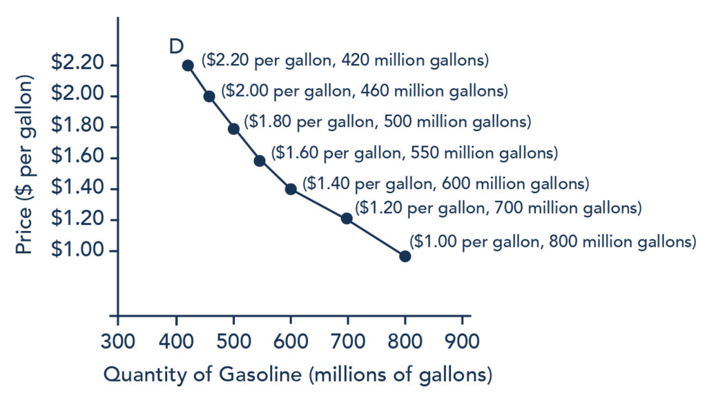 Figure 1. A Demand Curve for Gasoline (derived from the data in Table 1).
The demand schedule (Table 1) shows that as price rises, quantity demanded decreases, and vice versa. These points can then be graphed, and the line connecting them is the demand curve (shown by line D in the graph, above). The downward slope of the demand curve again illustrates the law of demand—the inverse relationship between prices and quantity demanded.
The demand schedule shown by Table 1 and the demand curve shown by the graph in Figure 1 are two ways of describing the same relationship between price and quantity demanded.
Demand curves look somewhat different for each product. They may appear relatively steep or flat, or they may be straight or curved. Nearly all demand curves share the fundamental similarity that they slope down from left to right. In this way, demand curves embody the law of demand: as the price increases, the quantity demanded decreases; and conversely, as the price decreases, the quantity demanded increases.
DEMAND VS. QUANTITY DEMANDED
In economic terminology, demand is not the same as quantity demanded. When economists talk about demand, they mean the relationship between a range of prices and the quantities demanded at those prices, as illustrated by a demand curve or a demand schedule. When economists talk about quantity demanded, they mean only a certain point on the demand curve, or one quantity on the demand schedule. In short, demand refers to the curve, and quantity demanded refers to the (specific) point on the curve.
Change in Demand vs. Change in Quantity Demanded
It’s hard to overstate the importance of understanding the difference between shifts in curves and movements along curves. Remember, when we talk about changes in demand or supply, we do not mean the same thing as changes in quantity demandedor quantity supplied.
A change in demand refers to a shift in the entire demand curve, which is caused by a variety of factors (preferences, income, prices of substitutes and complements, expectations, population, etc.). In this case, the entire demand curve moves left or right.

Figure 2. Change in Demand. A change in demand means that the entire demand curve shifts either left or right. The initial demand curve D0 shifts to become either D1 or D2. This could be caused by a shift in tastes, changes in population, changes in income, prices of substitute or complement goods, or changes in future expectations.
A change in quantity demanded refers to a movement along the demand curve caused only by a change in price. In this case, the demand curve doesn’t move; rather, we move along the existing demand curve.

Figure 3. Change in Quantity Demanded. A change in the quantity demanded refers to movement along the existing demand curve, D0. This is a change in price caused by a shift in the supply curve.
2. Factors Affecting Demand
LEARNING OUTCOMES
- Explain the factors that can change demand

We defined demand as the amount of some product that a consumer is willing and able to purchase at each price. This suggests at least two factors, in addition to price, that affect demand. “Willingness to purchase” suggests a desire to buy, and it depends on what economists call tastes and preferences. If you neither need nor want something, you won’t be willing to buy it. “Ability to purchase” suggests that income is important. Professors are usually able to afford better housing and transportation than students, because they have more income. The prices of related goods can also affect demand. If you need a new car, for example, the price of a Honda may affect your demand for a Ford. Finally, the size or composition of the population can affect demand. The more children a family has, the greater its demand for clothing. The more driving-age children a family has, the greater its demand for car insurance and the less for diapers and baby formula.
These factors matter both for demand by an individual and demand by the market as a whole. Exactly how do these various factors affect demand, and how do we show the effects graphically? To answer those questions, we need the ceteris paribusassumption.
Ceteris Paribus Assumption
A demand curve or a supply curve (which we’ll cover later in this module) is a relationship between two, and only two, variables: quantity on the horizontal axis and price on the vertical axis. The assumption behind a demand curve or a supply curve is that no relevant economic factors, other than the product’s price, are changing. Economists call this assumption ceteris paribus, a Latin phrase meaning “other things being equal.” Any given demand or supply curve is based on the ceteris paribus assumption that all else is held equal. (You’ll recall that economists use the ceteris paribus assumption to simplify the focus of analysis.) Therefore, a demand curve or a supply curve is a relationship between two, and only two, variables when all other variables are held equal. If all else is not held equal, then the laws of supply and demand will not necessarily hold.
Ceteris paribus is typically applied when we look at how changes in price affect demand or supply, but ceteris paribus can also be applied more generally. In the real world, demand and supply depend on more factors than just price. For example, a consumer’s demand depends on income, and a producer’s supply depends on the cost of producing the product. How can we analyze the effect on demand or supply if multiple factors are changing at the same time—say price rises, and income falls? The answer is that we examine the changes one at a time and assume that the other factors are held constant.
For example, we can say that an increase in the price reduces the amount consumers will buy (assuming income, and anything else that affects demand, is unchanged). Additionally, a decrease in income reduces the amount consumers can afford to buy (assuming price, and anything else that affects demand, is unchanged). This is what the ceteris paribus assumption really means. In this particular case, after we analyze each factor separately, we can combine the results. The amount consumers buy falls for two reasons: first because of the higher price, and second because of the lower income.
Effect of Income on Demand
Let’s use income as an example of how factors other than price affect demand. Figure 1 shows the initial demand for automobiles as D0. At point Q, for example, if the price is $20,000 per car, the quantity of cars demanded is 18 million. D0 also shows how the quantity of cars demanded would change as a result of a higher or lower price. For example, if the price of a car rose to $22,000, then the quantity demanded would decrease to 17 million, at point R.

Figure 1. Shifts in Demand: A Car Example
The original demand curve D0, like every demand curve, is based on the ceteris paribus assumption that no other economically relevant factors change. Now, imagine that the economy expands in a way that raises the incomes of many people, making cars more affordable. How will this affect demand? How can we show this graphically?
Return to Figure 1. The price of cars is still $20,000, but with higher incomes, the quantity demanded has now increased to 20 million cars, shown at point S. As a result of the higher income levels, the demand curve shifts to the right to the new demand curve D1, and this indicates an increase in demand. Table 1, below, shows clearly that this increased demand would occur at every price, not just the original one.
| Price | Decrease to D2 | Original Quantity Demanded D0 | Increase to D1 |
|---|---|---|---|
| $16,000 | 17.6 million | 22.0 million | 24.0 million |
| $18,000 | 16.0 million | 20.0 million | 22.0 million |
| $20,000 | 14.4 million | 18.0 million | 20.0 million |
| $22,000 | 13.6 million | 17.0 million | 19.0 million |
| $24,000 | 13.2 million | 16.5 million | 18.5 million |
| $26,000 | 12.8 million | 16.0 million | 18.0 million |
Now, imagine that the economy slows down so that many people lose their jobs or work fewer hours—reducing their incomes. In this case, the decrease in income would lead to a lower quantity of cars demanded at every given price, and the original demand curve D0 would shift left to D2. The shift from D0 to D2 represents such a decrease in demand: at any given price level, the quantity demanded is now lower. In this example, a price of $20,000 means 18 million cars sold along the original demand curve, but only 14.4 million sold after demand fell.
When a demand curve shifts, it does not mean that the quantity demanded by every individual buyer changes by the same amount. In this example, not everyone would have higher or lower income, and not everyone would buy or not buy an additional car. Instead, a shift in a demand curve captures a pattern for the market as a whole: increased demand means that at every given price, the quantity demanded is higher, so that the demand curve shifts to the right from D0 to D1. And, decreased demand means that at every given price, the quantity demanded is lower, so that the demand curve shifts to the left from D0 to D2.
We just argued that higher income causes greater demand at every price. This is true for most goods and services. For some—luxury cars, vacations in Europe, and fine jewelry—the effect of a rise in income can be especially pronounced. A product whose demand rises when income rises, and vice versa, is called a normal good. A few exceptions to this pattern do exist, however. As incomes rise, many people will buy fewer generic-brand groceries and more name-brand groceries. They are less likely to buy used cars and more likely to buy new cars. They will be less likely to rent an apartment and more likely to own a home, and so on. A product whose demand falls when income rises, and vice versa, is called an inferior good. In other words, when income increases, the demand curve shifts to the left.
Other Factors That Shift Demand Curves
Income is not the only factor that causes a shift in demand. Other things that change demand include tastes and preferences, the composition or size of the population, the prices of related goods, and even expectations. A change in any one of the underlying factors that determine what quantity people are willing to buy at a given price will cause a shift in demand. Graphically, the new demand curve lies either to the right (an increase) or to the left (a decrease) of the original demand curve. Let’s look at these factors.
Changing Tastes or Preferences

From 1980 to 2012, the per-person consumption of chicken by Americans rose from 33 pounds per year to 81 pounds per year, and consumption of beef fell from 77 pounds per year to 57 pounds per year, according to the U.S. Department of Agriculture (USDA). Changes like these are largely due to shifts in taste, which change the quantity of a good demanded at every price: that is, they shift the demand curve for that good—rightward for chicken and leftward for beef.
Changes in the Composition of the Population
The proportion of elderly citizens in the United States population is rising. It rose from 9.8 percent in 1970 to 12.6 percent in 2000 and will be a projected (by the U.S. Census Bureau) 20 percent of the population by 2030. A society with relatively more children, like the United States in the 1960s, will have greater demand for goods and services, like tricycles and day-care facilities. A society with relatively more elderly persons, as the United States is projected to have by 2030, has a higher demand for nursing homes and hearing aids. Similarly, changes in the size of the population can affect the demand for housing and many other goods. Each of these changes in demand will be shown as a shift in the demand curve.
Changes in the Prices of Related Goods
The demand for a product can also be affected by changes in the prices of related goods, such as substitutes or complements. A substitute is a good or service that can be used in place of another good or service. As electronic books, like this one, become more available, you would expect to see a decrease in demand for traditional printed books. A lower price for a substitute decreases demand for the other product. For example, in recent years, as the price of tablet computers has fallen, the quantity demanded has increased (because of the law of demand). Since people are purchasing tablets, there has been a decrease in demand for laptops, which can be shown graphically as a leftward shift in the demand curve for laptops. A higher price for a substitute good has the reverse effect.
Other goods are complements for each other, meaning that the goods are often used together, because consumption of one good tends to enhance consumption of the other. Examples include breakfast cereal and milk; notebooks and pens or pencils, golf balls and golf clubs; gasoline and sport utility vehicles, and the five-way combination of bacon, lettuce, tomato, mayonnaise, and bread. If the price of golf clubs rises, since the quantity of golf clubs demanded falls (because of the law of demand), then demand for a complement good like golf balls decreases, too. Similarly, a higher price for skis would shift the demand curve for a complement good, like ski resort trips, to the left, while a lower price for a complement has the reverse effect.
Changes in Expectations About Future Prices or Other Factors That Affect Demand
While it is clear that the price of a good affects the quantity demanded, it is also true that expectations about the future price (or expectations about tastes and preferences, income, and so on) can affect demand. For example, if people hear that a hurricane is coming, they may rush to the store to buy flashlight batteries and bottled water. If people learn that the price of a good like coffee is likely to rise in the future, then they may head for the store to stock up on coffee now. These changes in demand are shown as shifts in the curve. Therefore, a shift in demand happens when a change in some economic factor (other than the current price) causes a different quantity to be demanded at every price.
SUMMARY

Six factors that can shift demand curves are summarized in Figure 2, below. The direction of the arrows indicates whether the demand curve shifts represent an increase in demand or a decrease in demand. Notice that a change in the price of the good or service itself is not listed among the factors that can shift a demand curve. A change in the price of a good or service causes a movement along a specific demand curve, and it typically leads to some change in the quantity demanded, but it does not shift the demand curve.

Figure 2. Factors That Shift Demand Curves (a) A list of factors that can cause an increase in demand from D0 to D1. (b) The same factors, if their direction is reversed, can cause a decrease in demand from D0 to D1.
SHIFT IN DEMAND DUE TO INCOME INCREASE
A shift in demand means that at any price (and at every price), the quantity demanded will be different than it was before. The following is a graphic illustration of a shift in demand due to an income increase.
Step 1. Draw the graph of a demand curve for a normal good, like pizza. Pick a price (like P0). Identify the corresponding Q0. An example is shown in Figure 3.

Figure 3. Demand Curve. A demand curve can be used to identify how much consumers would buy at any given price.
Step 2. Suppose income increases. As a result of the change, are consumers going to buy more or less pizza? The answer is more. Draw a dotted horizontal line from the chosen price, through the original quantity demanded, to the new point with the new Q1. Draw a dotted vertical line down to the horizontal axis, and label the new Q1. An example is provided in Figure 4.

Figure 4. Demand Curve with Income Increase. With an increase in income, consumers will purchase larger quantities, pushing demand to the right.
Step 3. Now, shift the curve through the new point. You will see that an increase in income causes an upward (or rightward) shift in the demand curve, so that at any price, the quantities demanded will be higher, as shown in Figure 5.

Figure 5. Demand Curve Shifted Right. With an increase in income, consumers will purchase larger quantities, pushing demand to the right and causing the demand curve to shift right.
- Outcome: Demand. Authored by: Linda Williams, Steve Greenlaw, and Lumen Learning. License: CC BY: Attribution
- Revision and adaptation. Provided by: Lumen Learning. License: CC BY: Attribution
- Demand for Food Trucks. Authored by: Clark Aldrich for Lumen Learning. License: CC BY: Attribution
- Principles of Microeconomics Chapter 3.1. Authored by: OpenStax College. Provided by: Rice University. Located at: http://cnx.org/contents/ea2f225e-6063-41ca-bcd8-36482e15ef65@10.31:24/Microeconomics. License: CC BY: Attribution. License Terms: Download for free at http://cnx.org/content/col11627/latest
- Presto. Authored by: michaelgoodin. Located at: https://www.flickr.com/photos/michaelgoodin/6395014081/. License: CC BY-NC-ND: Attribution-NonCommercial-NoDerivatives
- Episode 11: Demand. Authored by: Dr. Mary J. McGlasson. Located at: https://www.youtube.com/watch?v=uXlZIn6W7Ew&feature=youtu.be. License: CC BY-NC-ND: Attribution-NonCommercial-NoDerivatives
- Episode 12: Change in Demand vs Change in Quantity Demanded. Authored by: Dr. Mary J. McGlasson. Located at: https://youtu.be/aTSwcXJ700c. License: CC BY-NC-ND: Attribution-NonCommercial-NoDerivatives
- Principles of Microeconomics Chapter 3.2. Authored by: OpenStax College. Provided by: Rice University. Located at: http://cnx.org/contents/ea2f225e-6063-41ca-bcd8-36482e15ef65@10.31:24/Microeconomics. License: CC BY: Attribution. License Terms: Download for free at http://cnx.org/content/col11627/latest
- Get targeted leads to shopify stores. Authored by: Rick Hanson. Located at: https://www.flickr.com/photos/realtrafficsource/15636059197/. License: CC BY-NC: Attribution-NonCommercial
- Grilled Chicken Feet. Authored by: Roger Smith. Located at: https://www.flickr.com/photos/rogersmith/8751424167/. License: CC BY-NC-ND: Attribution-NonCommercial-NoDerivatives
- Stock up. Authored by: Marc van Woudenberg. Located at: https://www.flickr.com/photos/mindcaster-ezzolicious/4467255185/. License: CC BY-NC-ND: Attribution-NonCommercial-NoDerivatives
- Diagonal shift test folds. Authored by: Rebecca Gieseking. Located at: https://www.flickr.com/photos/rgieseking/9595911874/. License: CC BY: Attribution
No Comments