
Build Structure for Clarity
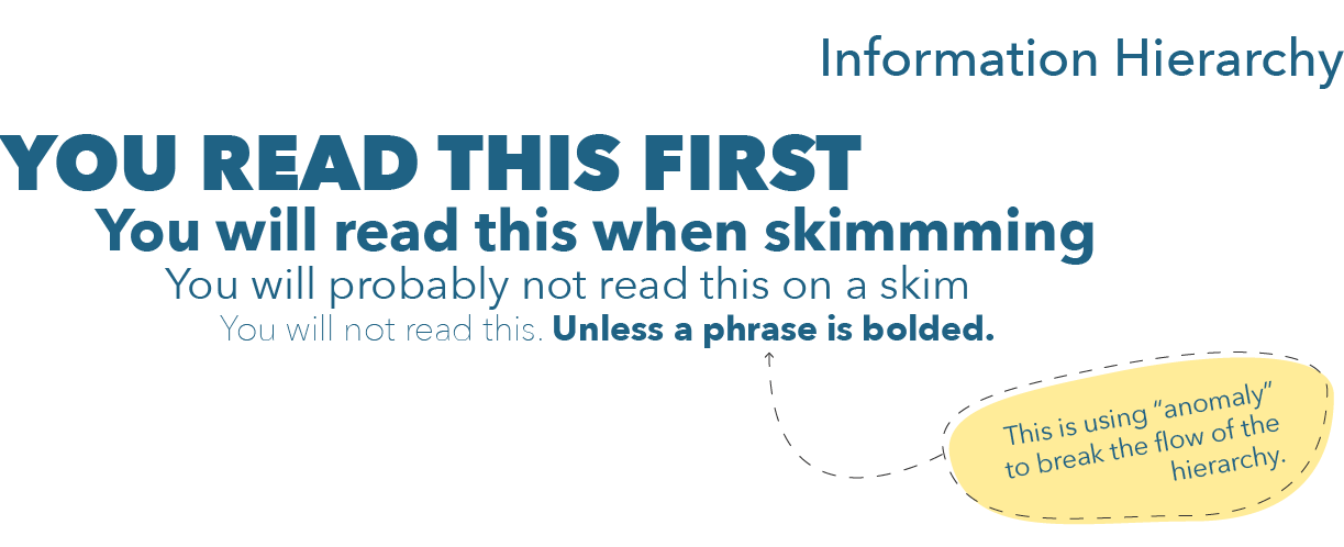
Building structure for clarity is all about making sure the message of a page gets across clearly and quickly. To do so, it is useful to follow basic principles of information and visual hierarchy, where the more important the information, the better positioned, bigger, brighter, and/or more colorful it is on the page (Figure 8.13).
Figure 8.13 Information Hierarchy
Follow the principle of Sullivan (the “father of skyscrapers”): Form follows function. Gone are the days when we designed webpages for purely aesthetic reasons. Webpages now have clear goals for visitors to achieve. Our objective as digital marketers is to make sure consumers achieve these goals. Design should support the achievement of goals rather than serve solely aesthetic purposes (i.e., designing a pretty website is not something we should solely strive for).
A useful, quick test to see if a page achieves a clear structure is the five second test. According to fivesecondtest.com,
Five second tests are a method of user research that helps you measure what information users take away and what impression they get within the first five seconds of viewing a design. They’re commonly used to test whether webpages are effectively communicating their intended message.
No Comments