Create Focus
Although we think of choice as a great thing, more options are associated with a breadth of negative consequences. According to leading psychologist Barry Schwartz, offering more choices makes people less likely to pick an option and more likely to be dissatisfied with the option they picked (TED Talk). Think of the last time you tried to pick a Netflix movie, for example. How long did it take you to choose a movie? How long would it have taken you if you only had two options? On webpages, more choices also mean more options offered to visitors and more chances that they will not do what they should be doing on a certain page.
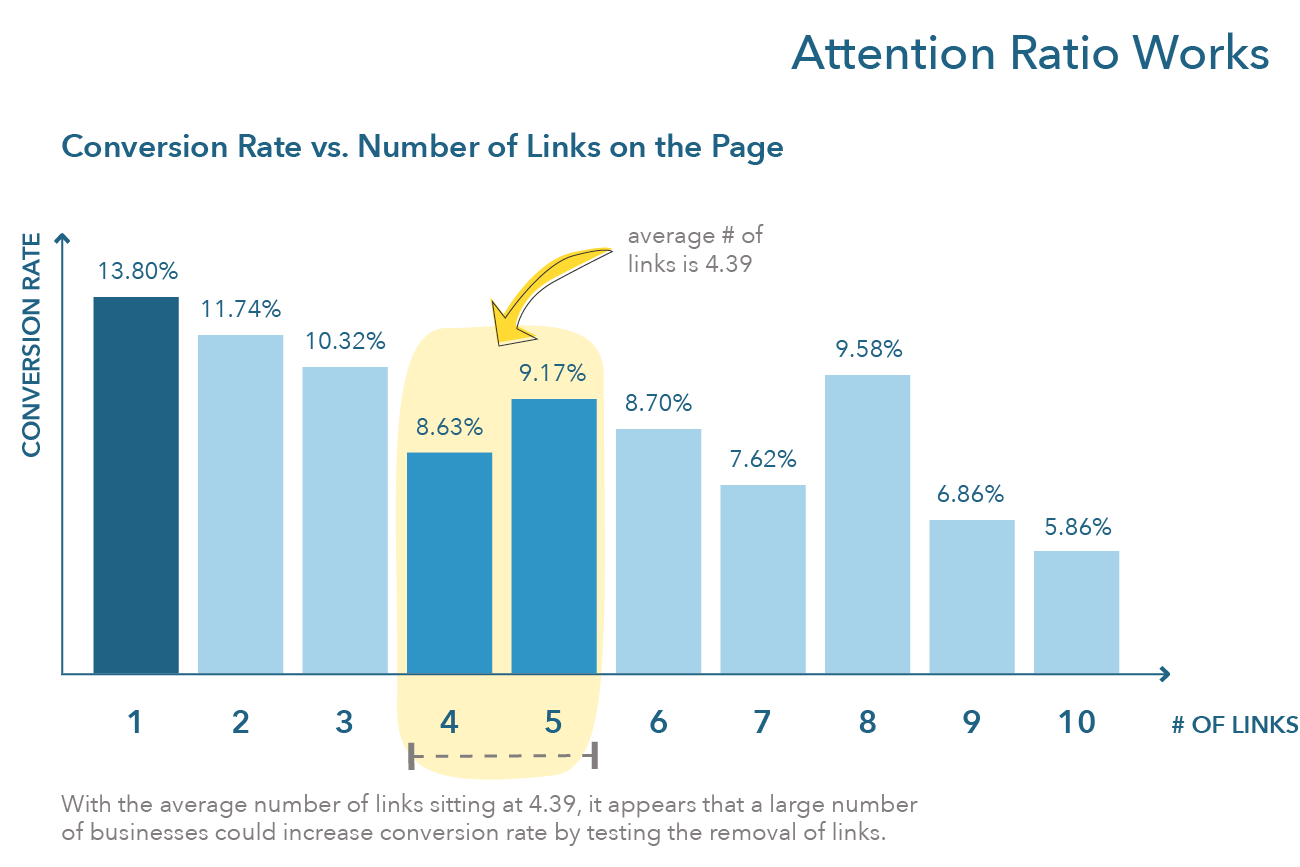
For this reason, the first principle asks you to create focus on your webpages. On landing pages, we saw that the lower the attention ratio (the ratio between goals and links on a page), the higher the conversion rate. In 2013, Unbounce analyzed more than 20,000 lead generation landing pages and found a negative relationship between conversion rate and number of links (related to attention ratio, Figure 8.6). Clearly, the more links on a lead generation landing page, the less likely a firm is to create a lead. Thus, to create focus on landing pages, firms should focus on a 1:1 attention ratio. To accomplish this, landing pages should aim to make visitors accomplish one goal and one goal only.
Figure 8.6 Attention Ratio Works

How does focus translate on other pages? Often, focus is achieved by drawing people’s attention to the goal they are the most likely to be wanting to accomplish by positioning this goal above the fold on a firm’s page. Concretely, this often translates on having only one call to action above the fold, where the call to action is associated with the goal that consumers should be achieving.
Let’s see a few examples of top websites: Optimizely, Mint and Discord, and fashion retailers.
Optimizely offers visitors personalized options depending on their roles. Engineers are asked to create a free account, product managers are invited to watch a demo, marketers can try a visual editor, data scientists are offered a white paper, and team leaders are directed to a guide to experimentation. In short, what Optimizely has done is (1) identify the main goal that each persona is likely to want to accomplish when visiting the firm’s website and (2) put this goal front and center.
Discord and Mint employ the same tactic: They offer visitors one option above the fold, that is, to use or sign up for their product. Below the fold, the strategy of both websites is also the same. They expand on the benefits of their products, what users should expect when they sign up, provide social proofing, and conclude this sales pitch with, again, an option to sign up or use the product. This is a typical homepage design strategy for firms that sell one or a few products, such as Paperlike, which we discussed in our exercise for the last chapter.
Altitude-sports.com, an online retailer, employs a strategy typical for this type of website: They offer one or more links that will move the visitor to a section of the website where they can shop (see also FARFETCH). There are different approaches to doing this. MR PORTER invites consumers to visit different product categories that align with the season, such as rain jackets for Fall, as well as a link to new items. END., a clothing retailer, pursues a strategy typical of the niche menswear market and invites consumers to register for drops. An alternative for retailers that have content-heavy websites is to drive visitors to content articles (SSENSE follows this strategy), probably in a bid to become a privileged source of information for high fashion and turn readers into customers.
Importantly, for retailers and other types of websites, the number of links that visitors can click above the fold is limited. In all of these examples, visitors are offered a maximum of three options above the fold (not including the menu).

No Comments